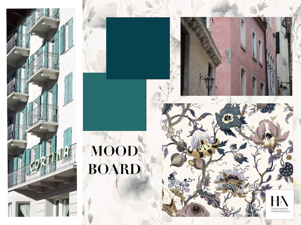
Rich green. Plum. And pale pink…
It could be the start of a beautiful fairy tale and it certainly is. Inspired by some holiday photo’s I took last year in Cortina and Venice, I made a mood board to find a good combination of the colours I admire.
Taking photos of cities and buildings is where you can gain inspiration for colours and materials to bring back home. Sometimes you want to take home the atmosphere and the spirit, and I also took home the colours.
A mood board is a perfect way to visualise ideas, and then add on different products, paint, wallpaper, flowers and colours to achieve a look. You don’t need to overdo it – pick something you need and that you know will be long-lasting.
If it’s too much with a wallpaper in your living room, why not freshen up the guest room, the hallway or the little bathroom?
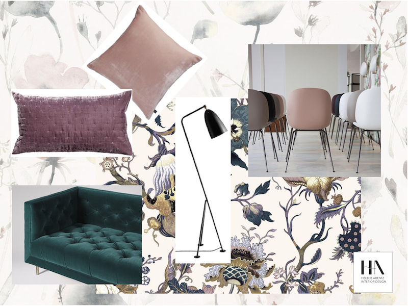
- This beautiful wallpaper of flowers is called “Artemis Ivory” and is a fantastic base to pick colours and details from for furniture.
- A paler version of a flower wallpaper is used in my mood board as a backdrop, called “Lo Watercolour” from Sandberg Wallpaper Backdrop.
- The green paint is “Canto 94” and “Marine blue 95” from thelittlegreene.com. The chairs are a scoop, whether you are looking for a lounge chair, dining chair or a bar chair you should take a look at the series Beetle collection from gubi.com. Here shown as dining chairs.
- The sofa in green velvet is “Vincent” from swoon.co.uk. Check the price, bargain!
- The plum cushion is H&M’s velvet cushion cover.
- The pale cushion is “Regency pink velvet” from habitat.co.uk.
- And, as always, add something black! Look at this stylish floor light Gubi “Grashoppa”.
Written by Helene Arentz
Instagram: @hainteriordesign
Twitter: @ArentzHelene
Facebook: @hainteriordesign


About The Author
Helene Arentz
Scandinavian interior designer Helene is a doyenne of creative home transformation, pairing personality and atmosphere with beautiful functionality. This is her inside story…